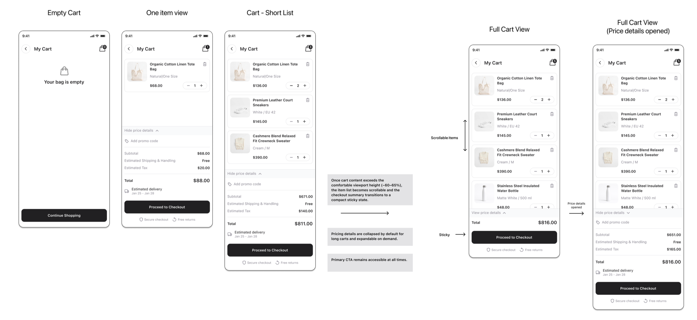
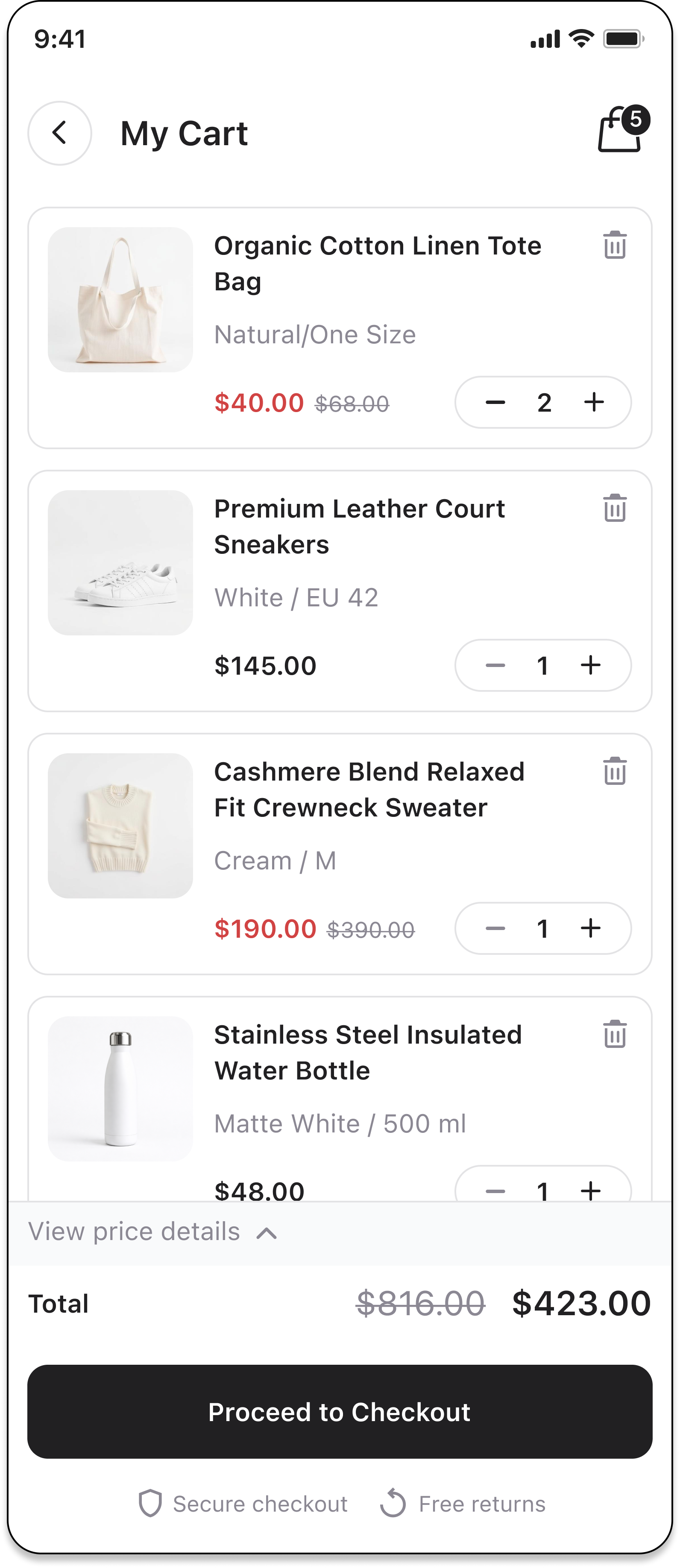
Shopping card mobile view design
I designed a mobile shopping cart experience focused on clarity, efficiency, and a seamless checkout flow.
The goal was to help users quickly review their items, make last-minute adjustments, and proceed to checkout with confidence. By reducing visual clutter, improving pricing transparency, and enabling inline edits, the design minimizes friction and supports faster decision-making
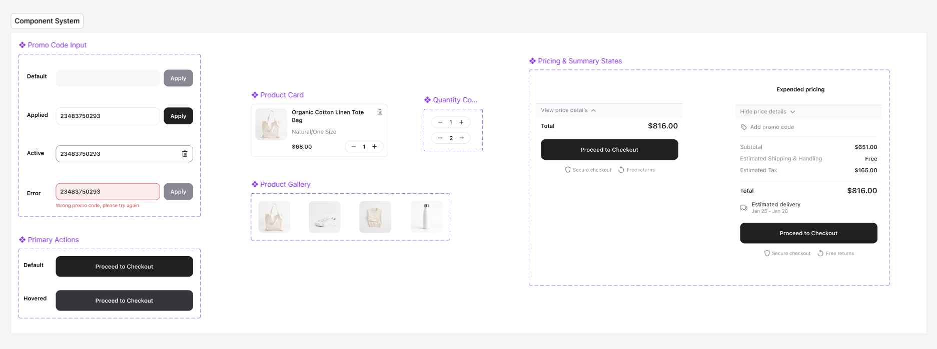
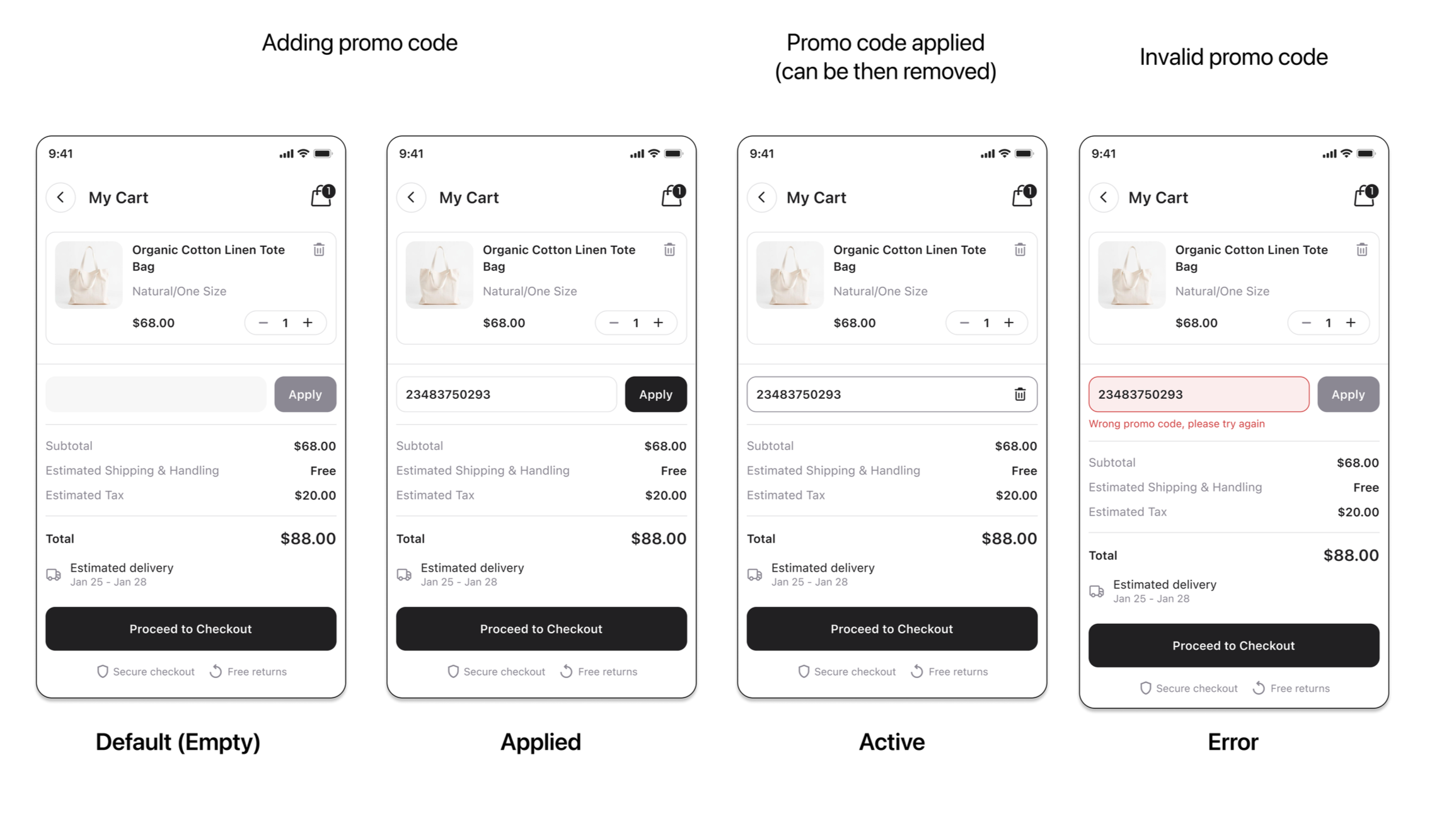
Promo code
Discount Prices
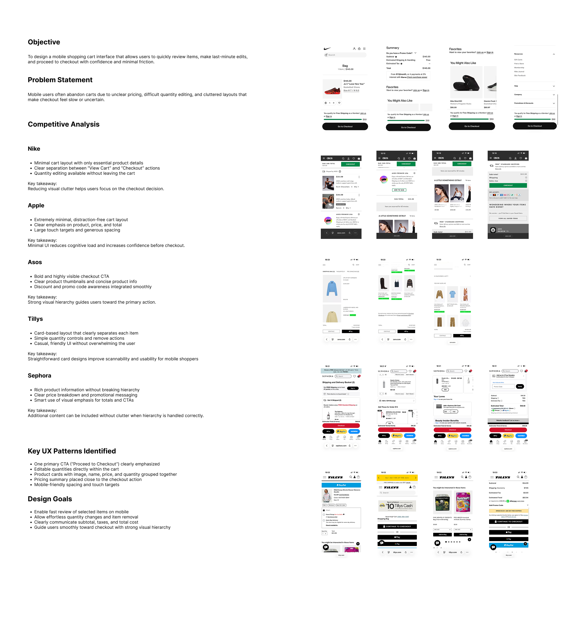
Research & Inspiration
Before starting the project, I researched and analyzed leading e-commerce platforms to understand how they design mobile shopping cart experiences.
I analyzed products from brands like Nike, Apple, ASOS, Tillys, and Sephora, focusing on layout structure, pricing clarity, quantity editing, and checkout flow.
This research helped me identify common UX patterns such as:
Clear checkout actions
Editable quantities directly within the cart
Strong visual hierarchy for pricing, tax, VAT, and totals
Minimal, distraction-free layouts
These insights guided my design decisions and helped me create a more intuitive and efficient cart experience.
I designed a reusable component system to ensure consistency and clarity across the cart experience. Each component supports quick edits, clear pricing visibility, and a seamless checkout flow.